Tuesday, October 16, 2012
Lab 3 - Google Maps
View Road Trip in a larger map
I think one of the pitfalls of neogeography is that the information may not be accurate. Since anybody is allowed to create a map, the information that is provided may be wrong. The information may also be edited by anyone else, so it is hard to figure out how credible the information is going to get. Two people can make the same map, but have different information associated with their map. This way, it is going to be difficult to find the map that has the correct information versus the one that does not, or maybe even both maps may be incorrect too.
On the other hand, I think neogeography also helps to promote new places. Some people like to try new things so they would go somewhere new and put it up on the internet that way other people can get an idea of what that place is like. When neogeography is used like this, a lot more information gets shared. But if the information is inaccurate then it will affect a lot of people, depending on how many people see the information. If people professionally went out and record new places then I think that neogeography is going to be really useful. If professionals or someone really interested in this particular topic created the information then there would be a smaller chance of providing the wrong information, so people can trust it more.
Tuesday, October 9, 2012
Lab 2 - Beverly Hills Quadrangle
1. The name of the quadrangle is Beverly Hills.
2. The names of the adjacent quadrangles are Canoga Park, Van Nuys, Burbank, Topanga, Hollywood, Venice, and Inglewood.
3. The quadrangle was created in 2012.
4. The datum used were North American Datum of 1983, and World Geodetic System of 1984.
5. The scale of the map is 1:24,000.
6. a) 5 centimeters on the map is equal to 1,200 meters on the ground
b) 5 inches on the map is equal to about 2 miles on the ground
c) one mile on the ground is equal to about 2.64 inches on the map
d) 3 kilometers on the ground is equal to 12.5 centimeters on the map
7. The contour interval on the map is 20 feet.
8. a) 118°28'42" (118.4783°) longitude, 34°04'23" (34.0731°) latitude
b) 118°30'00" (118.5°) longitude, 34°00'45" (34.0125°) latitude
c) 118°25'11" (118.4197°) longitude, 34°06'15" (34.1042°) latitude
9. a) 560 feet; 171 meters
b) 140 feet; 43 meters
c) 700 feet; 213 meters
10. The UTM zone of the map is zone 11.
11. The UTM coordinates for the lower left corner of the map is about 362500E 3763200N.
12. The area contained within each cell is 1,000,000 square meters.
13.

14. The magnetic declination of the map is 12°35'.
15. The water is flowing north.
16.

2. The names of the adjacent quadrangles are Canoga Park, Van Nuys, Burbank, Topanga, Hollywood, Venice, and Inglewood.
3. The quadrangle was created in 2012.
4. The datum used were North American Datum of 1983, and World Geodetic System of 1984.
5. The scale of the map is 1:24,000.
6. a) 5 centimeters on the map is equal to 1,200 meters on the ground
b) 5 inches on the map is equal to about 2 miles on the ground
c) one mile on the ground is equal to about 2.64 inches on the map
d) 3 kilometers on the ground is equal to 12.5 centimeters on the map
7. The contour interval on the map is 20 feet.
8. a) 118°28'42" (118.4783°) longitude, 34°04'23" (34.0731°) latitude
b) 118°30'00" (118.5°) longitude, 34°00'45" (34.0125°) latitude
c) 118°25'11" (118.4197°) longitude, 34°06'15" (34.1042°) latitude
9. a) 560 feet; 171 meters
b) 140 feet; 43 meters
c) 700 feet; 213 meters
10. The UTM zone of the map is zone 11.
11. The UTM coordinates for the lower left corner of the map is about 362500E 3763200N.
12. The area contained within each cell is 1,000,000 square meters.
13.
14. The magnetic declination of the map is 12°35'.
15. The water is flowing north.
16.
Tuesday, October 2, 2012
Lab 1 - Sharon Xu

Source: Munster, Sebastian. Munster's Map of the World - 1544. N.d. Map. n.p. Web. 2 Oct 2012. <http://floridahistory.com/us@1544.html>.
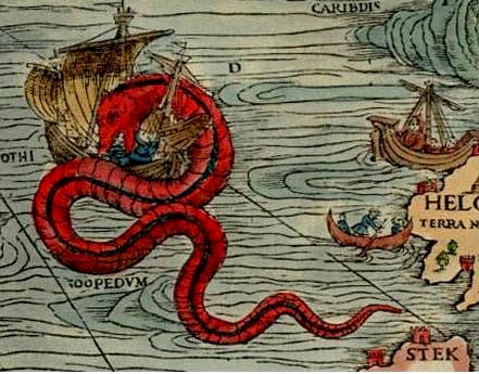
Source: cantueso. Old Sea Maps with Monsters. 2008. Map. wordpress.com Web. 2 Oct 2012. <http://espliego.wordpress.com/2008/01/08/old-sea-map-with-monsters/>.

Source: Rabinky, Maria. Tampa Bay Aerial Map. 2008. Map. wikipedia.org Web. 2 Oct 2012. <http://en.wikipedia.org/wiki/Pictorial_maps>.
Subscribe to:
Comments (Atom)