Tuesday, November 20, 2012

Lab 7 - Census 2000


     These are maps created on ArcMap about the population in 2000, the difference in the population between 1990 and 2000, the percent change from 1990 to 2000 of the total population, and the population density in 2000 of the United States. It was interesting to see the maps change color depending on what information is put in. It was easy to see the distribution of everything based on the colors. The colors also change depending on what break value is inputted so more of one color might show up depending on what the values are. The instructions on how to create these maps was fairly easy to follow, so I did not have any problems completing this lab. This function is extremely efficient at displaying data on a map, the data is easy to understand.

     The first map is about the number of people in the United States in the year 2000. It is based on the column labeled APRO1_2000 from tab01. From the map, the United States is less populated in the middle and more populated to the southwest and northeast. For all the maps, the projection was changed to North American Lambert Conformal Conic. The Census 2000 data in tab01 and the Counties shapefile were joined using the column ST_CO_FIPS as the key field.

     The second map is about the difference between the population in 2000 and the population in 1990. There are some areas where the population change has a negative value, which means people are moving away from those areas. The color for the negative values show up mainly in the middle of the United States. The field used for this map is POP_CHANGE. The southwest of the United States has the largest area of a population increase between 1990 to 2000.

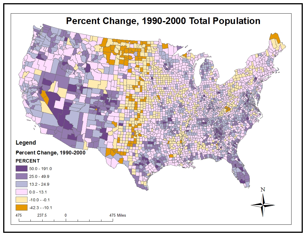
     The third map is about the change in percentage of the population between 1990 and 2000. It is similar to the second map, but this one is using percentage instead of the number of people. The break values for this map is different from the second map so the areas with the same color do not match up. The counties in orange had the greatest drop in percentage of their population.

     The final map is about the population density of the United States in 2000 in units of people per square mile. For this map, the data used was under the column labeled POP00_SQMI. I used the field calculator to fill in this field in the Attribute Table with the expression [Tab01.APRO1_1990] / [Counties.AREA]. The northeast of the United States along part of the east coast has a large area where it is densely populated. There are also parts where the population density is extremely small.

Tuesday, November 13, 2012

Lab 6 - DEMs


The area that is shown here is in Colorado. It includes a part of the Arapaho National Forest, Mt Evans, and cities like Evergreen, Lakewood, and Idaho Springs. I used itouchmap.com/latlong.html to find where this area was located using the extent information from the original DEM.

Extent information (in decimal degrees):
top: 39.829
left: -105.788
right: -104.969
bottom: 39.383

Geographic coordinate system: GCS_North_American_1983
Datum: D_North_American_1983
Angular Unit: Degree (0.0174)

Wednesday, November 7, 2012

Lab 5 - Projections


     In this lab, I had to find three different kinds of projections: equal area, equidistant, and conformal. There are two maps for each type of projection. I think this lab showed how important map projections are because depending on what needs to be done, one projection would be better than another. There are so many different types of projections because it is so difficult to represent a sphere on a piece of paper, changing from 3-D to 2-D. That means there is going to be distortion somewhere on the map no matter which kind of projection is used.

     But because there are so many different maps and projections, it is confusing trying to remember which type of map would be good for looking at for something and which is not. I do not think it is easy to remember what map is what kind of projection just by looking at it so it would be hard to figure out what is distorted. But with ArcMap, it is easier to manage all the different kinds of projections so it would be much more organized.

     So one of the good things about ArcMap is that it helps keep all the different kinds of projections organized and easy to access. It would be easy to pull up the projection that is needed and compare it to another projection. But in ArcMap, the projections are not necessarily labeled equal area, equidistant, or conformal so a little bit of research still needs to be done to figure out what kind of projection you are really looking at.

     Because there are so many types of projection, even if ArcMap can keep them organized, I think there are going to be a lot of confusion if someone did not really understand what they are doing. I did not even know maps had different features depending on how they are drawn. I realized from this lab that there are more to maps than meets the eye.

Thursday, November 1, 2012

Lab 4 - ArcMap


     For this lab, I had to follow a tutorial on how to create an ArcMap. The tutorial was easy to follow, each step was very detailed so it was not too difficult to complete this assignment. Also, it was a long tutorial so it was hard to complete the whole tutorial all at once. Since I am new to this, I was afraid of making a mistake and having to complete the tutorial all over again from the beginning after already spending a lot of time on it. It was a bit hard to locate all the tools that were necessary for this lab, since the lab computers had a newer version of the program, some of the tools were a bit different than described on the tutorial.
     Even though the tutorial for the ArcMap was easy to follow, it does not mean that it would be easy to understand all the materials covered. To be honest, I just followed the steps, but I had no clue what each step was about until I read it over again after I finished the tutorial. I do not think I would be able to remember all these steps if I had to redo this map without the tutorial. The beginning of the tutorial was still understandable, but as I got farther and farther through the tutorial I was kind of lost about what I was doing to the map.
     About half way through I encountered a problem with my map, I was having trouble with adding data to one of the attribute tables. The tutorial wanted to join the data of two different attribute tables and also create a new column within the joined attribute table and input an equation into the field calculator to fill in the column. I did exactly what the tutorial said, but the data did not show up for the population density field. This then messed up my map for the following steps because it required the data that was supposed to be inputted from the previous step, which would not show up on my attribute table.
     Since this lab took a lot more time, it was difficult finding the software to complete this with. Luckily, there was remote access available to students during after hours. But it was a pain trying to work using the remote access. It was really slow and it would not seem to load anything that was on my flash drive. So I had to move my folders into one of the folders on that computer, which took more time, and that got it to work but it was still slow.